ShopDreamUp AI ArtDreamUp
Deviation Actions

Private collection, please do not unlock
private drawings such as sketches, portraits and various handmade drawings. Due to the fact that it is not possible to hide folders, I decided to use this form of collecting my works
$100/month


Suggested Deviants


Suggested Collections


You Might Like…


Featured in Groups


Description
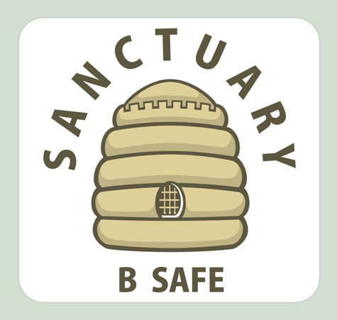
Sanctuary is a project in the South East of London where designated buildings are deemed safe houses for children and young adults who feel they may be under threat from bullies.
The scheme is that at these safe houses are patrollers who are trained to counsel young people who feel they are at risk. These patrollers are nicknamed bumble bees, because they have a black and yellow uniform. The client wanted, if possible, a logo that would in some way could incorporate the idea of the patrollers and their role, thus I went for a bee hive fortress design.
It works on a few levels. The first is that the colours are warm and inviting and bee hives are traditionally a symbol of industry and hard workers, workers that co-operate and work together. This is particularly important for this logo.
I then added the battlements to the top tier of the beehive to give the impression that this is a logo which not only says strong, but safe. Finally the portcullis in the bee hive opening reiterates that idea of being safe.
The additional "B Safe" slogan plays on the idea of bees and also makes reference to mobile phone text shorthand appealing to the target group that this logo is aimed at. It also sends a message that in all aspects of life we should try and be safe.
Time: 1 week
Medium: Photoshop Vectors
Reference: Sketching, doodling and reading...
Image size
475x451px 86.25 KB
© 2011 - 2024 NotTheRedBaron
Comments0
Join the community to add your comment. Already a deviant? Log In